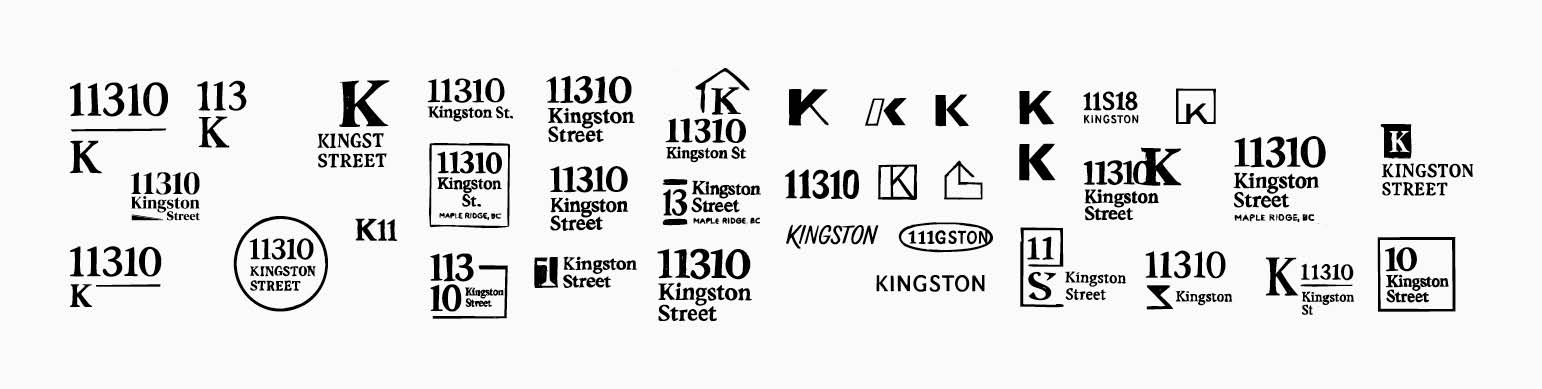
Kingston Industrial needed a clear identity to stand out in Metro Vancouver’s competitive industrial market.
The site lacked cohesive branding, making it difficult for brokers to communicate its scale, access, and development potential.
The Goal
Build a unified visual presence that positions Kingston as a credible industrial opportunity — not just another listing.
My Approach
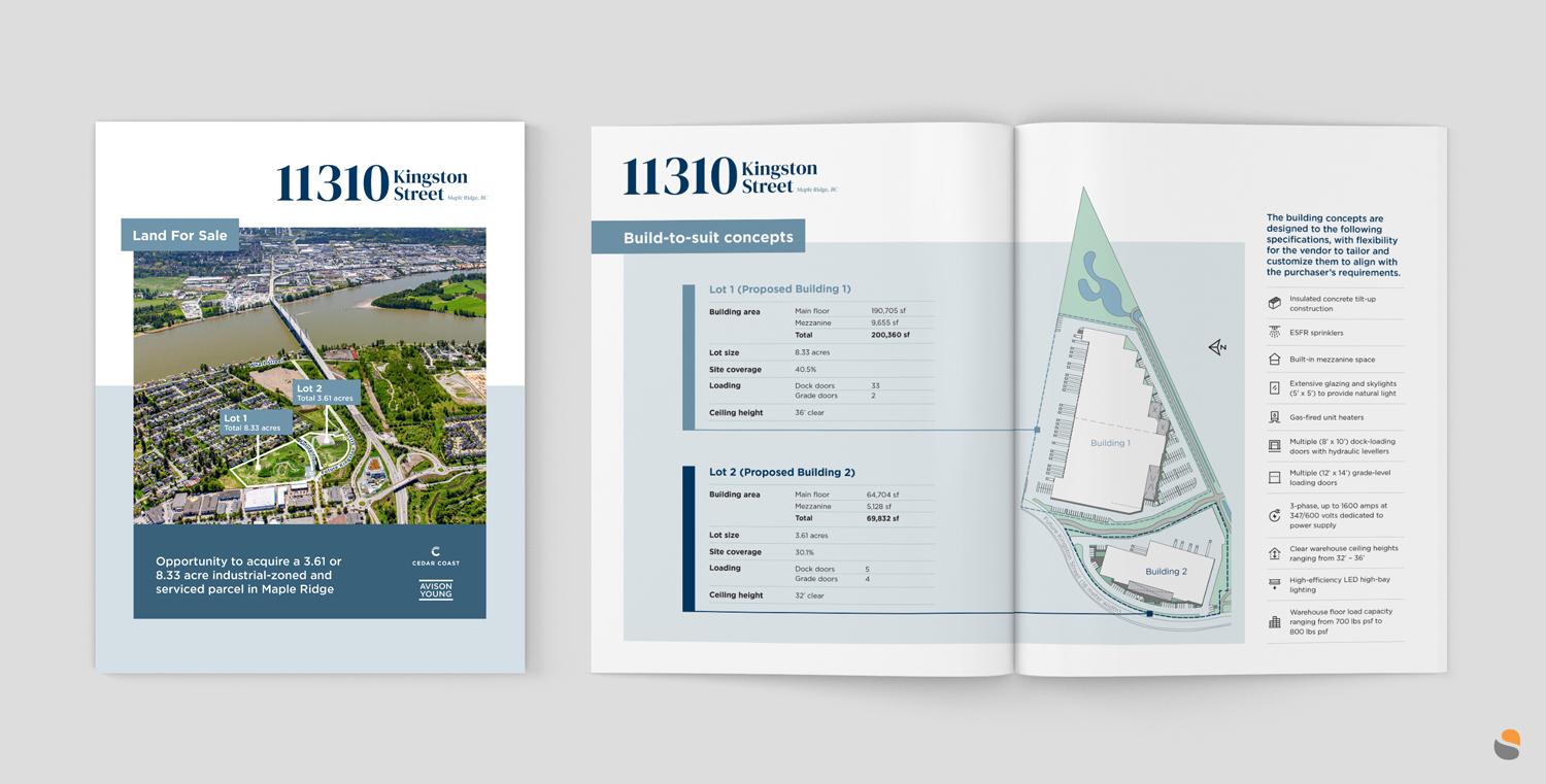
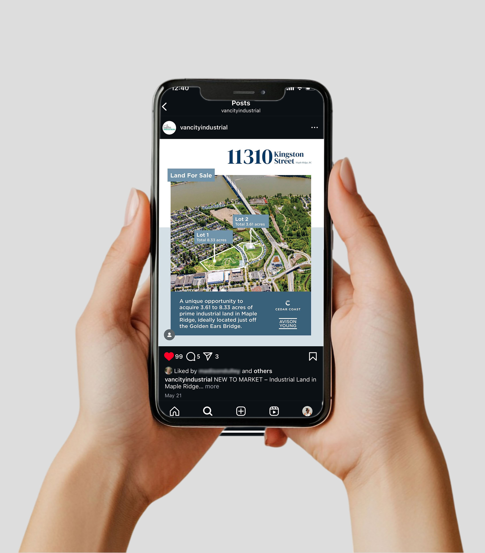
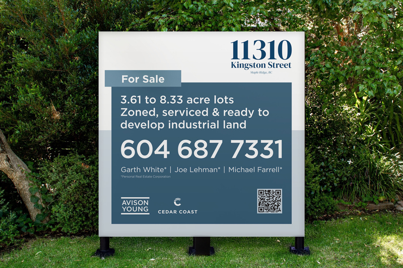
I focused on clarity and professionalism: strong serif typography, clean grids, and layouts that highlight acreage, access, and build-to-suit flexibility.
Every asset was designed to be easy for brokers to present and immediately understandable for investors.
The Outcome
A cohesive brand system across print, signage, and digital that strengthened Kingston’s market presence and equipped the team with polished, confidence-boosting marketing materials.